Start Selling with LaunchMyStore Today
Start your online business today and get everything you need to build, manage, and grow your online store.


15 Best Ecommerce Website Examples to Learn From in 2026
 James Crawford
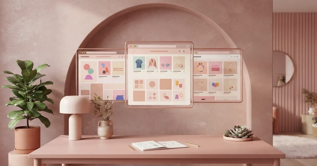
Start your online business today.
For free.
Start for freeThe best ecommerce website examples in 2026 share five traits: instant clarity about what they sell, fast mobile-first pages, product photography that answers questions, visible trust signals, and one obvious next step on every screen. Below are 15 stores worth studying — from Allbirds' benefit-driven copy to Aesop's editorial minimalism — with the specific, copyable idea behind each one.
- 75% of shoppers judge a company's credibility by its website design, per Stanford's Web Credibility Research.
- 53% of visitors abandon a site that takes over 3 seconds to load (Forrester), so speed is a design feature.
- Smartphones drive nearly 80% of retail website visits (Statista, 2025) — every example below is mobile-first.
- Users read only about 20% of the text on a page (Nielsen Norman Group), which is why the best stores sell visually.
- You don't need a big budget to copy these patterns — you need one clear idea per page.
What Makes an Ecommerce Website Great in 2026?
Great store design is measurable, not subjective: Stanford's Web Credibility Research found 75% of users judge credibility from design alone, Forrester (2024) shows 53% abandon pages slower than 3 seconds, and Nielsen Norman Group data says visitors read only ~20% of on-page text. So the winning formula is visual clarity, speed, and scannability — every example below executes at least one of those unusually well.
Why Store Design Decides Sales
Sources: Stanford Web Credibility Research; Forrester 2024; Statista 2025; Nielsen Norman Group
Which Ecommerce Websites Should You Study?
Fifteen stores, each chosen for one specific pattern you can copy. Don't clone whole sites — steal the single idea each one proves.
1. Allbirds — Benefit-First Product Copy
Every material gets translated into a feeling: wool "breathes naturally," tree fiber is "cool in the heat." Copy the pattern: describe outcomes, not specs, above the fold on product pages — the same rule we teach in writing product descriptions that sell.
2. Glossier — Brand World Consistency
Packaging, palette, photography, and microcopy all speak one visual language, making the store feel like the product. Copyable idea: pick two brand colors and one photography style, then enforce them everywhere.
3. Aesop — Editorial Minimalism
Long-form typography, muted tones, and zero clutter create a luxury feel with almost no design elements. Copyable idea: white space is free — remove one element from every section and clarity rises.
4. Purple — Comparison Built Into the Page
Mattress options sit in one-to-one comparison tables with pricing visible before scrolling, killing the biggest purchase anxiety (choosing wrong). Copyable idea: if you sell variants, compare them for the customer on-page.
5. Grind — Subscription Clarity
The coffee brand makes "subscribe and save" the default path with honest per-delivery pricing and easy pause controls. Pair it with our subscription ecommerce guide.
6. Gymshark — Social Proof at Scale
Athlete imagery, UGC galleries, and review counts turn the store into evidence. Copyable idea: put your review count in the header of every product page, not the footer.
7. Warby Parker — Risk Reversal as Hero Message
"Try 5 frames at home, free" removes the core objection of buying glasses online and leads the homepage. Copyable idea: your returns policy is marketing — surface it, don't bury it.
8. Bombas — Mission Woven Into Checkout
The one-bought-one-donated counter follows the shopper to the cart, adding purpose to every purchase. Copyable idea: quantify your mission and show it at the decision moment.
9. Casper — Objection-Ordered Page Structure
Product pages answer questions in the exact order shoppers ask them: comfort → trial → shipping → reviews. Copyable idea: order sections by objection, not by aesthetics.
10. Patagonia — Values as Navigation
Repair guides and activism sit beside products, deepening trust with its exact audience. Copyable idea: one non-selling page (care guide, sourcing story) makes the selling pages more credible.
11. MVMT — Aspirational Lifestyle Grids
Watches shot in travel scenes sell identity, with prices anchored against luxury alternatives. Copyable idea: show the product in the life your buyer wants, not on white alone.
12. Chubbies — Personality-Driven Microcopy
Every button, tooltip, and email subject is a joke aligned to the brand voice, making the store memorable and shareable. Copyable idea: rewrite five default UI strings ("Add to cart," "Sold out") in your own voice.
13. Beardbrand — Content-Commerce Hybrid
Grooming education feeds product discovery, with articles linking straight into kits — a model for shoppable content.
14. Brooklinen — Bundles as the Default Offer
Sheet "starter bundles" cost less than piecing items together, raising order value while simplifying choice — the strategy from our bundling and upselling playbook.
15. Ritual — Radical Transparency Design
Every ingredient's source is mapped and visible, turning supply-chain honesty into the core visual feature. Copyable idea: whatever competitors hide, show it — transparency is a design pattern.
What Patterns Repeat Across All 15 Examples?
Strip away the aesthetics and five structural patterns appear in nearly every store above:
- One message above the fold: what it is, who it's for, why it's different — in under 10 words.
- Product photos that answer questions: scale, texture, context, and on-body/in-use shots (see our product photography guide).
- Trust signals near the buy button: reviews, guarantees, and shipping promises within thumb's reach of "Add to cart."
- A single accent color for actions: every clickable "next step" shares one color nothing else uses.
- Speed as a feature: minimal scripts, compressed images — the discipline covered in store speed optimization.
Pro Tip: Screenshot your homepage and a competitor's, shrink both to phone width, and blur them slightly. If a stranger can't tell what YOU sell in three seconds from the blurred version, your hierarchy — not your products — is the problem.
How Do You Apply These Ideas to Your Own Store?
Pick three examples that match your category, extract one pattern from each, and implement them as a single design sprint. Modern theme systems make every pattern above achievable without code — customizable sections, review blocks, and bundle widgets are standard in quality themes now (our guide to choosing an ecommerce theme shows what to look for). Redesign one page per week: homepage, best-seller product page, then cart. Measure conversion before and after each change so improvements are proven, not assumed.
Frequently Asked Questions
What is the best ecommerce website example to copy?
Copy patterns, not sites. Allbirds is the strongest single model for benefit-driven copy, Purple for on-page comparison, and Warby Parker for risk reversal. Choose the example solving YOUR weakest page — most stores gain fastest from fixing product-page structure first.
What makes an ecommerce website design good?
Three measurable things: credibility (75% of users judge it from design, per Stanford research), speed (53% leave after 3 seconds, per Forrester), and scannability (users read ~20% of text, per Nielsen Norman Group). Aesthetics only matter after those three are solved.
How many products should an ecommerce homepage show?
Show 4-8 curated bestsellers, not the whole catalog. The homepage's job is direction, not browsing: one hero message, one featured collection, social proof, and a clear path to category pages. Every example above follows this restraint.
Can a small store look as good as these examples?
Yes — every pattern here is structural, not budget-dependent. One accent color, benefit-first copy, visible reviews, and compressed images cost nothing. Premium themes on modern platforms ship these patterns pre-built, so execution is configuration, not custom design work.
How often should I redesign my ecommerce website?
Continuously in small steps, rarely all at once. Full redesigns risk traffic and conversion shocks; instead run monthly one-page improvements measured against conversion data. Reserve full redesigns for rebrands or platform migrations, and A/B test the riskiest changes first.
Written by
James Crawford
Ecommerce Specialist at LaunchMyStore. Helping online businesses scale with data-driven strategies and the latest ecommerce best practices.
 Keep Reading